
Map And/In History
By Erich Pelletier
Map And/In History first appeared on the Navigator by CompassLearning on January 23, 2014.
I think maps are really cool. Always have. It’s sort of a family thing, and I inherited the map bug pretty strongly. To me, a good map can paint a picture of a place that, with a little imagination, can allow you to almost travel there without ever moving. Of course, they’re useful too: not only do maps help us navigate through the world, they can help us to better understand it. When well designed, they can communicate enormous amounts of nuanced data (scientific, historical, entertainment, and so on) in a way that is intuitive and rapidly digestible. Of all the methods we have available to us for visual communication, expression, and learning, maps are sort of my favorite.
Over the past couple of decades, we’ve seen mapping move beautifully into the digital realm. The intersection of global positioning technologies, geographic information systems, and innovative graphical interfaces has resulted in a suite of tools and products that allow us to carry infinitely interactive maps around in our pockets. This intersection has also allowed maps to become a powerful web-based teaching tool. From National Geographic to the Library of Congress (to name just two among hundreds of examples), putting maps and mapping tools online has become One of the Things to Do for map-ish people.
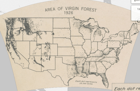
One of my current favorites is a project that was just launched this past December by the Digital Scholarship Lab (DSL) at the University of Richmond. The Atlas of the Historical Geography of the United States is a deft reimagining of the classic notion of “atlas.” Putting it in their words:
Here you will find one of the greatest historical atlases: Charles O. Paullin and John K. Wright’s Atlas of the Historical Geography of the United States, first published in 1932. This digital edition reproduces all of the atlas’s nearly 700 maps. Many of these beautiful maps are enhanced here in ways impossible in print, animated to show change over time or made clickable to view the underlying data—remarkable maps produced eight decades ago with the functionality of the twenty-first century.
One of the things that really strikes me about this digital atlas is the multilayered opportunity to use it as a teaching and learning object. Yes, the information in the atlas is not up to date, but that fact in itself can raise compelling questions about how the cultural lens of our historical moment has an impact on activities like mapmaking. Not only do the maps in the atlas “…show ordinary people making a living, moving across the landscape, worshiping at churches, voting in elections,” (and, I would suggest, they do so in a manner that’s still factually accurate), but the maps themselves are a cultural artifact situated in the time in which they were created.
Visit the atlas here and see for yourself: http://dsl.richmond.edu/historicalatlas/
Check out what CompassLearning Odyssey® has to say about maps and their role in history on our Sample Activities page (look under Social Studies / High School World Geography / Geography and History).
Erich Pelletier is a graduate of the University of Texas at Austin (Master of Arts – Radio-TV-Film) and has served in a wide range of roles in the eLearning industry for nearly a decade. He focuses on web design and video production as the Interactive Marketing Manager at Compass Learning.
CompassLearning is a Getting Smart Advocacy Partner.


0 Comments
Leave a Comment
Your email address will not be published. All fields are required.