Why I Teach On Udemy
By Chris Converse
I teach the way I like to learn, by completing a task. My style of teaching varies from traditional curriculums in that I show the steps necessary in completing a project, regardless of the academic structure of the task as a whole. My courses are constructed to offer a cross-section of the main principles, then offer tangents that people can explore on their own. This method ensures that people get to ‘touch’ and ‘experience’ all aspects of a project, while sparking additional interests in particular aspects.
Since my “day job” is designing and developing interactive content for Cōdify Design Studio, we run across many real-world scenarios that force us to combine technique across disciplines. This results in things like responsive imagery, as well as responsive design, when developing websites optimized for mobile and desktops. This unique technique was included as one of the three main aspects of my Creating Responsive Web Design for Udemy. By combining real-world solutions as part of my project-based courses, people get the chance develop solutions that range across disciplines.
Teaching With a Strategic Cross-section
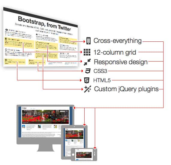
My next course on Udemy, Create an Engaging Website with Twitter Bootstrap, will be teaching people how to create an interactive, responsive, and animated websites using Twitter Bootstrap. After evaluating many frameworks, I choose Twitter Bootstrap for my next course because it offers an impressive combination of design, development, and user experience. As this framework gains momentum, designers will find that they can incorporate more advanced interactions into their web pages, while developers will welcome a starting point that bypasses aspects of the design.

In developing this course, I came up with a design, and project scope, that incorporates many of the key aspects of the Twitter Bootstrap framework. This allows my subscribers to explore key aspects of the framework in a meaningful way, and, hopefully, inspire them to explore more aspects upon the course’s conclusion. In addition, the course yields a final, “ready-for-primetime” web page that subscribers can customize and publish; or sell to their clients.
Combining Techniques From Courses
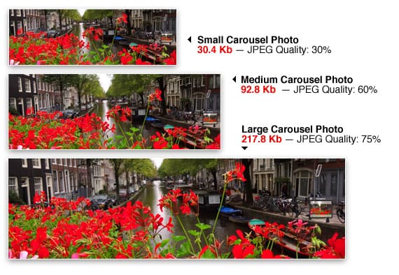
One great feature of the Twitter Bootstrap framework is plugins. These provide a quick architecture for adding interactive and engaging content. In the course we use both the Carousel and Typehead (for autosuggest). While the Carousel plug-in does respond in layout to screen size, the image download does not.

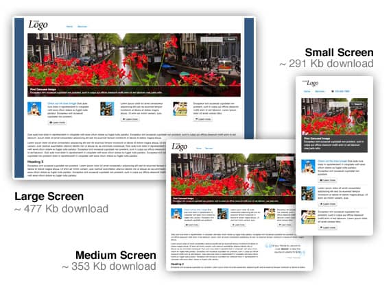
To remedy this, I combine the Responsive Download technique in my first course, Creating Responsive Web Design, with the open-source Carousel plug-in of my second course, and provide my subscribers with a website that adapts design, layout, and download times based on screen sizes. This results in a web page that saves small screen viewers nearly 40 percent% in data that needs to be downloaded — resulting in an optimized user experience for all visitors.

The above diagram shows the relative download sizes of the final web design created in the Udemy course “Create an Interactive Webpage with Twitter Bootstrap.” To take this design for a test drive, visit this following URL with your smart phone, tablet or computer: http://codifydesign.com/go/twitter-bootstrap.

Communication With Subscribers
In addition to a platform that gives me full control over my course, the Udemy system also provides discussions around each course. This proved invaluable to me as I began to plan my second course. As I followed the questions and suggestions my subscribers made, I started to make different decisions about how I constructed my second course.
One of the biggest changes in my second course is the length of my videos. I had many comments about how it was difficult to find specific aspects of the course within 15- to 25-minute movies. While this is not a huge issue the first time someone takes the course, later referencing is not a fast as it could be. To make reviewing the material faster in my second course, I recorded many more movies that range between three and seven minutes in length.
Another new feature of the second course is code snippets. Subscribers of my second course will only code the ‘unique’ aspects of the project, and cut-and-paste the more mundane aspects. This will result in final project that is broader, and provide them with more aspects to add their content to at a later time.
I’m excited to see how changes affect the experience for my subscribers, and look forward to how they can help me with course number three!
Chris Converse is a designer, photographer, and web developer at Codify Design Studio. Chris is a regular featured speaker at Adobe MAX, HOW Design and Interactive Conferences, AIGA, and Mogo Media events. Watch his courses on Lynda.com, Find his video workbooks Bring Your Web Design to Life and Creating Interactive Documents on your favorite bookstore’s website, follow him on Twitter, or friend him on Facebook.


0 Comments
Leave a Comment
Your email address will not be published. All fields are required.